AMP is a young startup specialising in the holistic areas of yoga, hormone balance, and nutrition.
With a uniquely designed typeface, the logo represents individuality and timeless design, giving the brand strong recognition value.


MIT TIM is Tim's company, founded to provide him with the 24/7 personal assistance he needs due to his diagnoses of autism and epilepsy. The name "MIT TIM" captures the essence of this work: it is about supporting Tim in his daily life, creating freedom for him, and balancing out the areas where he faces challenges. This assistance allows him to lead an independent life, with caregivers mindfully dedicating their time "MIT TIM".
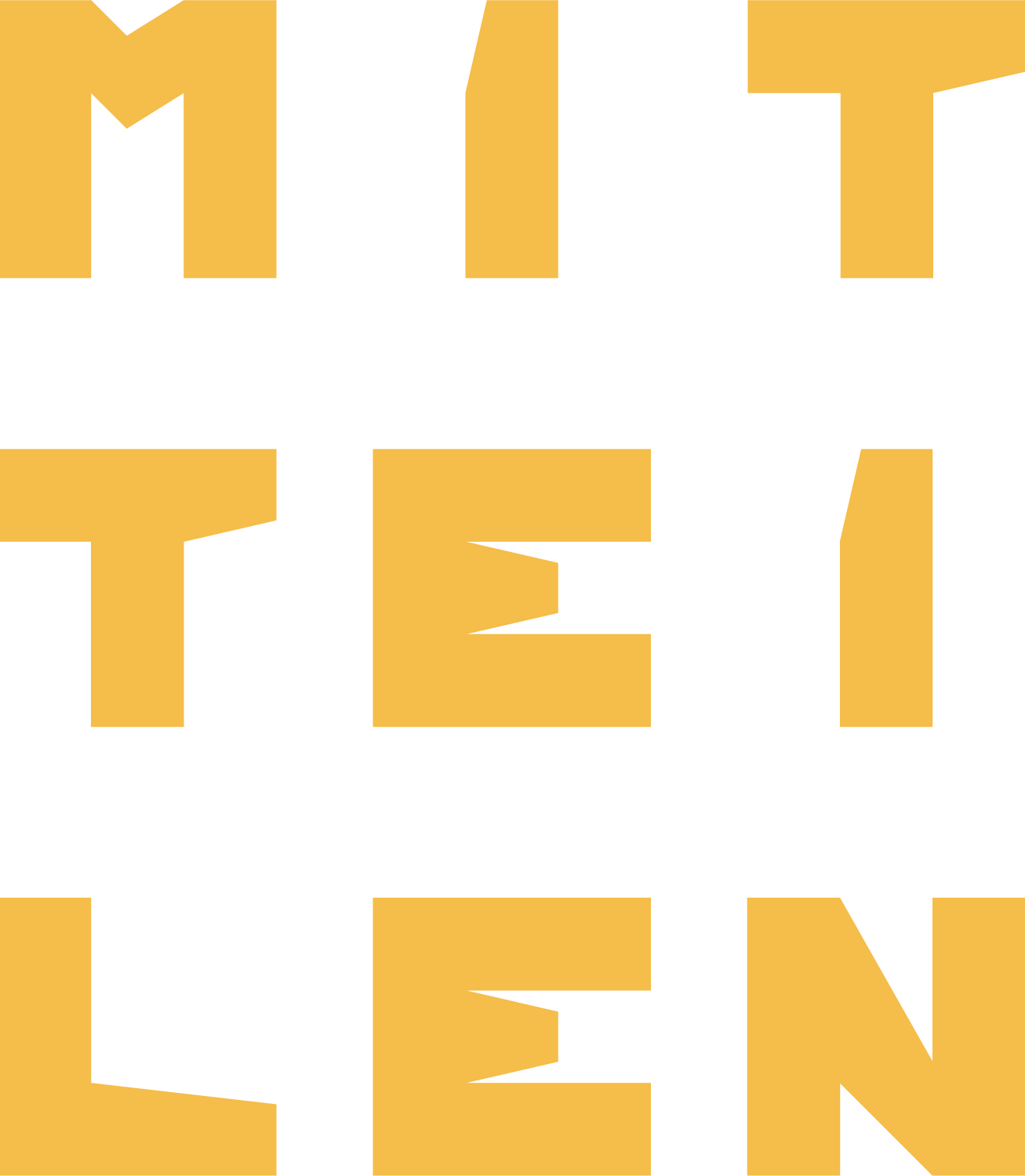
The MIT TIM logo reflects the essential role of this assistance: the reversal of "TIM" to "MIT" symbolises mutual support and collaboration. This concept is visually reinforced with a distinctive point symmetry. The letters of the logo are individually crafted, carrying a personal touch—just as unique as the shared time and support MIT TIM [WITH TIM].
The brand development at MIT TIM is centred around specially crafted sub-logos that help structure the organisation and make the shared experience truly unique. These sub-logos embody core values and categories that define our work: MITeinander [Togetherness], MITteilen [Sharing], MITgefühl [Empathy], MITmachen [Responsibility], and MITwachsen [Growth].
These values offer guidance to our team, enabling them not only to support Tim but also to gain valuable experiences and grow themselves. This time spent WITH TIM creates a space for mutual learning, genuine connection, and personal growth—for everyone who joins us on this journey.
That’s what I’m currently working on!


